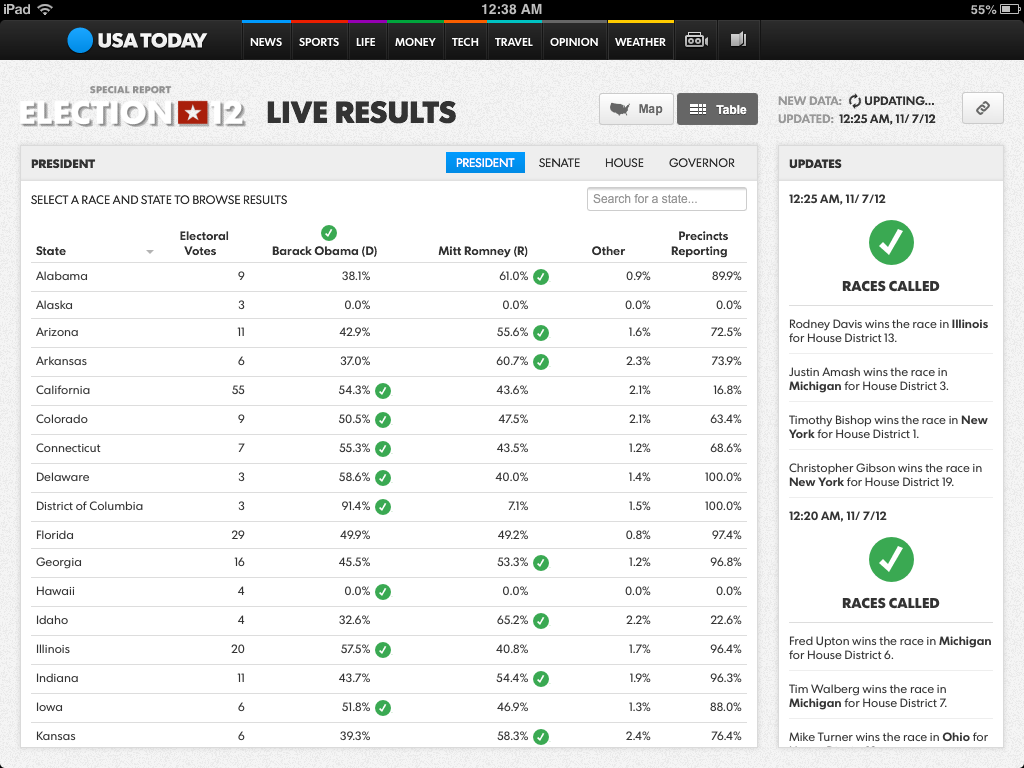
Realtime Election 2012 Results Maps
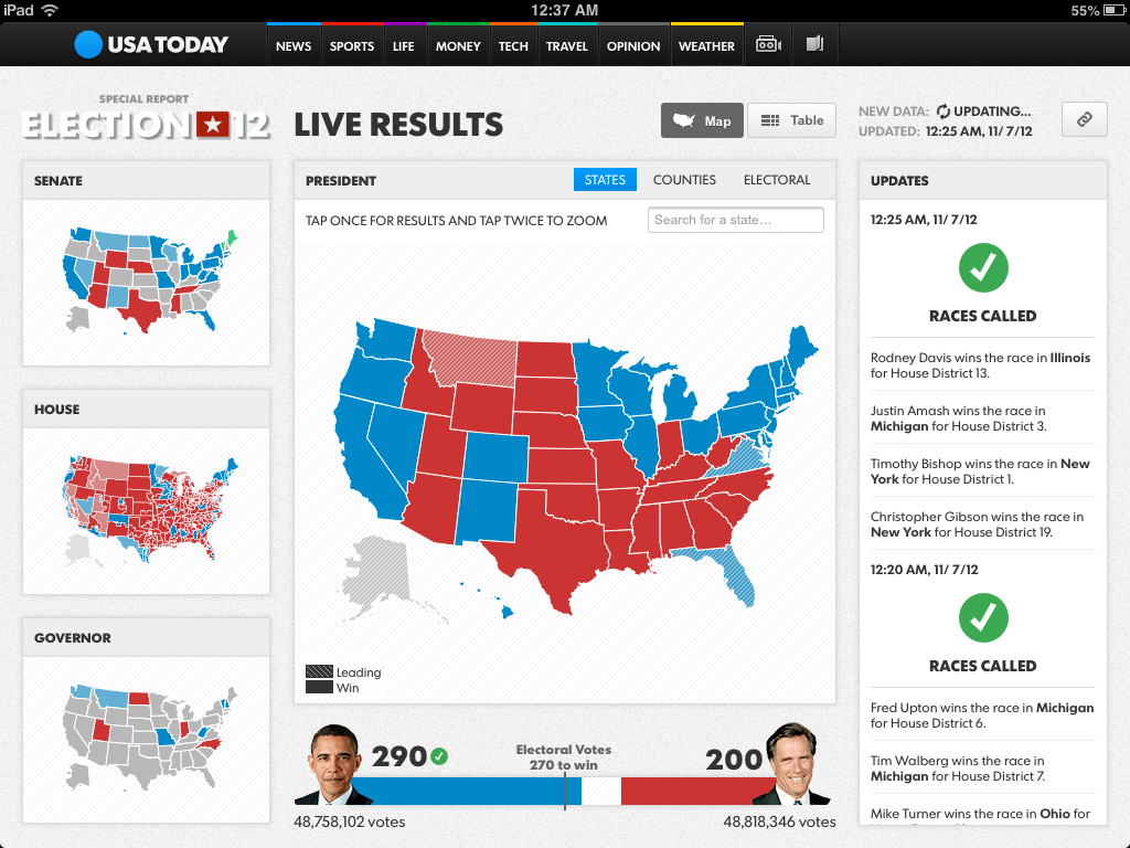
Throughout the 2012 election cycle, we’ve been fascinated with idea of visualizing realtime election results. On election day starting when voting concludes on the East Coast, newsrooms race to process and visualize vote totals in each of the 50 states, 435 congressional districts, and 3,200 counties across the country. The Associated Press provides a feed of results data aggregated from staff deployed across the country on eight minute intervals. Since nearly all news outlets subscribe to this data, the race to report results first is really about having an incredibly short time to publish, while maintaining a steadfast focus on reliability during what’s often the highest traffic night for news websites. The excitement of the night and availability of a reliable source of fast data make this a really exciting problem to solve.
In the thick of a massive redesign and brand overhaul across all printed and electronic media, USA TODAY brought on our team to help them build a new realtime election mapping platform. Our work culminated in a responsively designed web application that powered a full screen dashboard, a smart phone and tablet view, and eight different embeddable views used throughout election night on the USATODAY.com homepage and several topic and article pages. Here’s how we built it.

The maps
Our first decision was around how to render the maps in a way that would maximize reliability while reducing time to update. We considered a few options for this:
- Live rendering tile server: We configure TileMill on a server to generate map tiles on a schedule with the release of new results data. The map tiles would be hosted on mapbox.com to ensure the highest possible availability. This option was appealing because we’ve worked extensively with tile-based maps, including the MapBox Streets base layer, but it would mean considerable modifications to our hosting server to allow for faster than hourly updates.
- Server-side static map image generation: We have TileMill render full view maps instead of map tiles. These images could be hosted on any static file web server with fast update times. However the need for a dozen different views multiplied by hundreds of electoral races made this option less appealing, and we’d need to build a custom method of interactive overlays.
- Client-side dynamic image manipulation: If we render all map images ahead of time and manipulate only the colors of the map’s features in the browser based on results data, we would have the benefit of reliable tile hosting combined with fast data refreshes and low tile generation overhead. This option had a lot of promise, and we had a working sample project that would load image tiles with each state, congressional distrcit, or county colored by a hexadecimal representation of its FIPs ID and use an HTML5 Canvas and JavasScript to evaluate the initial color of each pixel, decode its FIPs value, and recolor it according the latest results data. This scales well and preserved the high resolution of features available with image tiles. Ultimately though, it would require significant investment in a Flash fallback for Internet Explorer 8 and loading tiles from the remote mapbox.com origin into a Canvas element introduces cross-domain security issues.
- SVG vectors with VML fallback: This option won for a few reasons. First, there are several well established and easy-to-use libraries for SVG vector rendering that would allow us to do all of the map processing right in the browser and require absolutely no server-side infrastructure. We figured any server would be a considerable failure point, so this was important for ensuring reliability. And it would not require as much custom development as the previous Canvas-based approach.


Rendering the maps
We chose D3.js to handle SVG map generation. D3 provides a simple interface for building SVGs, as well as native support for map projections and transitions. Since it doesn’t get bogged down with supporting legacy browsers without SVG support, we switched over to R2D3 for versions of Internet Explorer less than IE9.
D3’s projection support includes Mercator and Albers, as well as an option to set your own. For national views we used an Albers projection, but for state-wide views we instead used the spherical Mercator projection in MapBox.js so we could overlay the maps on the MapBox terrain layer. This was relatively easy to do — depending on the map’s zoom level, we changed the projection function. We also used D3 to animate the reprojection process for a smooth transition effect.
Geodata processing
Our maps required two inputs: geographic data for the shapes of and election results values for each political division. We used Census shape files for states and counties, and newly redistricted congressional districts from Azavea. The source shape files were several megabytes each, so we needed to simplify their geographic detail considerably to get them small enough to transfer over the internet load in the browser. Our target was no more than 300kb gzip compressed size per file.
Nate processed the data with a whole suite of open source tools including QGIS, PostGIS, and GDAL OGR. The first challenge was to reduce geographic complexity and maintain adjacent boundaries — more technically known as preserving topology. Secondly, we needed to make sure the boundaries of features on different layers of data match — for example, when we layer state borders over congressional districts — which we solved by clipping congressional districts and counties to the boundary of each parent state.
Pretty quickly we realized that we could not depend on one simplification file to give us both the small file size and high resolution detail we wanted. So we produced a set of heavily simplified congressional districts to use along with D3’s included simplified counties and states. This data would be used for small maps, like the thumbnails for each race, the national House race map, and the national county-level maps. For zoomed views, like when you click on a state to see county level detail, we produced higher resolution files for each state of all of that state’s counties and congressional districts. The application then dynamically loads data as you navigate the map. When you load the initial view, you receive a few simplified files to draw low resolution thumbnails and a high resolution main map of states. When you click on a state, a high resolution file of counties for that state loads, providing better detail without needing to preload a lot of extra geographic data.


In the end, we essentially built an API for requesting geographic data at two simplification levels. To make it scale, we did not do the processing on the fly. Requesting geographic data from a live database is a completely unnecessary risk when the geographic data is not going to change. We rendered all of the data to flat geoJSON text files that we hosted will all of the applications other static files.
The web application
As with the maps, we achieved high scalability and reliability by offloading as much as possible of the web application to the browser. There was no backend server application behind the web application. A single Backbone.js web application powered all of the embeds, full screen dashboard, and smart phone and tablet views.


Initially, viewing the application only loads the most basic HTML layout and starts the Backbone router. Depending on the URL hash of the request, the router dynamically loads the rest of the HTML layout. Going to /#embed loads a particular embed view, whereas requesting /#map or /#table loads a main application map or table view. Additional values following the view parameter determine configuration settings like embed size, race, and state. For embeds, the main application with appropriate URL hash gets embedded in an iframe. For the main application, as you click through, you trigger new routes by updating the URL hash with new parameters, which updates the page without the need for a full refresh.
For a complex application like this, we spent a lot of time in partnership with USA TODAY’s staff designing and developing the web application. But the principle is simple - lazily request only the data you actually need for a given view, including the HTML template, geodata, and results data. This allows us to have a large client-side application hosted on a single html page with no server application requirement.
Results data API
With the USA TODAY team, we drew up a spec for a simple JSON API to transfer the live election results. They built a process to ingest the Associated Press’s XML data and expose it according to the API’s schema. We predetermined and calculated all possible requests so they could be cached in a CDN with a very high TTL. There was little chance requests would ever need to go back to the data API’s server. Only one API endpoint updated frequently - a simple number of the latest version of data available on the server. The web application polled this endpoint every 30 seconds to make sure it had the latest data. If the API response had a higher number, the application knew new data was available and would issue requests against the endpoints it needed to rebuild its current view. The method provided a balance between detecting and updating data changes quickly and having highly cacheable requests to protect the API server. Since this would be the only part of the entire application that would require a server-side application, it was crucial to have a reliable caching process.
Version-controlled data
We initially set up a version control process on each of the eight minute data updates as a reliability failsafe. If anything went wrong in a new version of data, we could always roll back to a previous one. But we soon realized that these versions provided an interesting by-product - we could analyze differences between the versions to produce a feed of updates to draw viewers’ attention to the latest news coming out of the results data.
The updates feed listed three main events - new states reporting results, races called for a candidate, and states that swung to a different party in the presidential election compared to 2008. Simple comparisons between the versions made it possible for us to show the narrative of the night through changes in the data. With an average time on site of about ten minutes, we were very excited by this feature.